Sparkle Women’s Conference
Art Direction, Photo Direction, Styling
A Fresh Take on a Women’s Conference
Every year, River Valley Church hosts Sparkle Women’s Conference—a 2-day conference at Minneapolis Convention Center. Approximately 3,000 women from Minnesota and beyond come together to gather, learn and worship. The objective for the conference is for women to leave feeling rejuvenated, reconnected and inspired.
In 2020, the Women’s Ministry Team at River Valley Church approached the Marketing Team with a verse; Acts 20:20. “You know how I’ve taught you in public meetings and in your homes, and that I’ve not held anything back from you that would help you grow.”. With that verse as our inspiration, we created the visual identity of Sparkle Women’s Conference for this year: All-In.
Art Direction
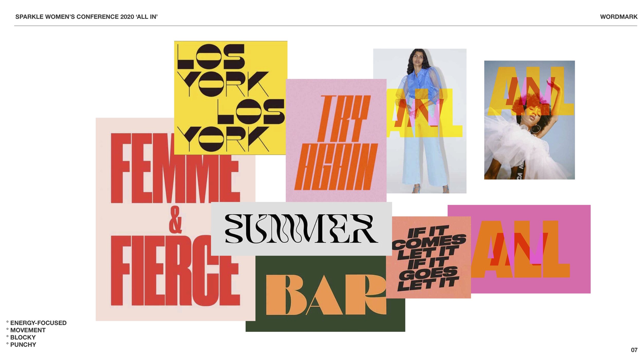
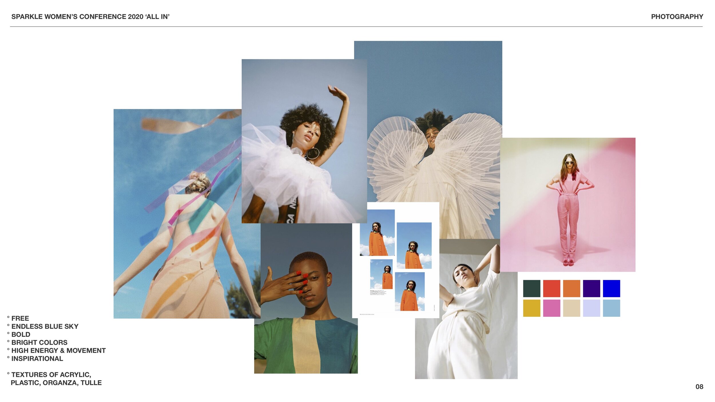
The Sparkle Conference team already had a visual reference for what they were envisioning for the brand—a mural they saw in the streets of Sydney, Australia (pictured below) evoked the feeling of what ‘All-In’ felt like to them. It feels limitless, bold, an explosion of life and color. With the theme, the main verse, and an example image as anchors to the visual identity, I began to expand the art direction into more specifics: color palette, photography, illustration techniques, and print layouts. Annie Judd (an incredible designer) took this direction and made it happen.
Photo Direction
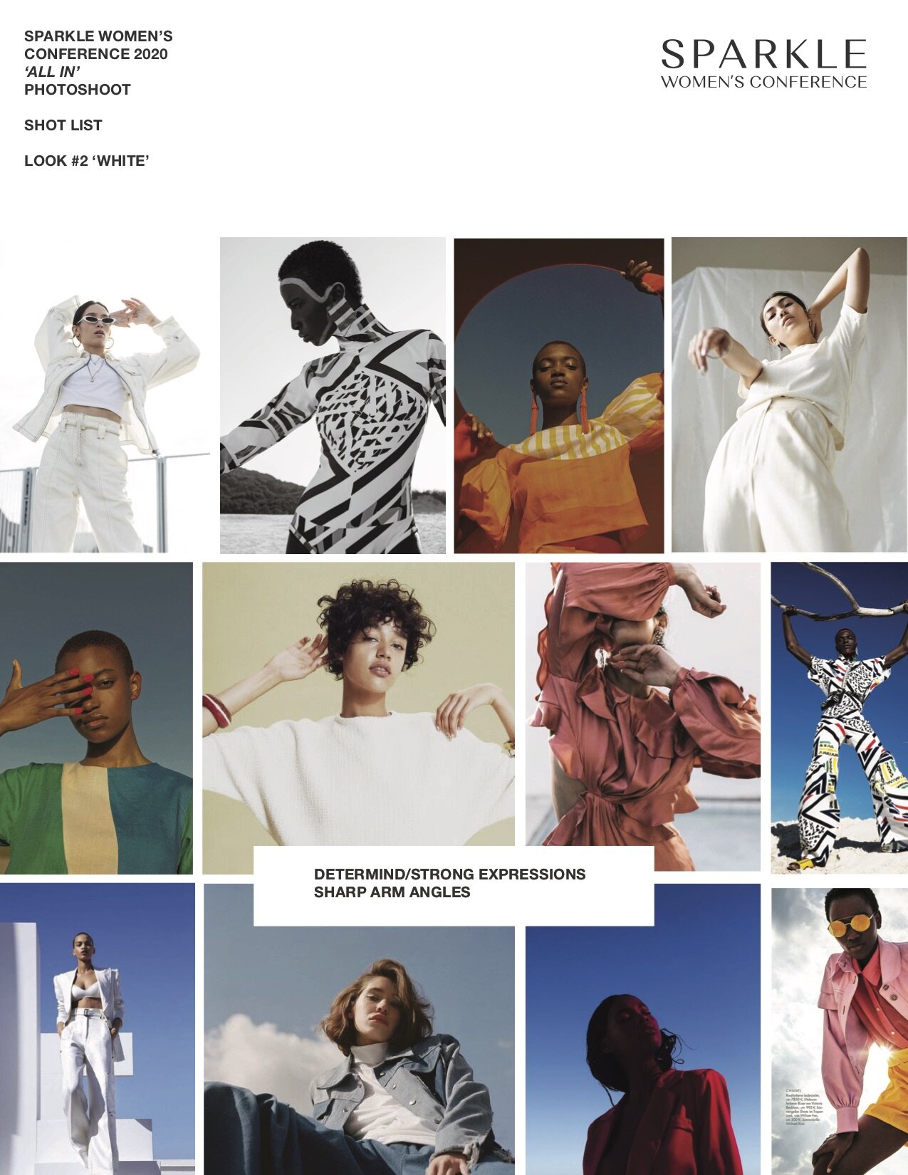
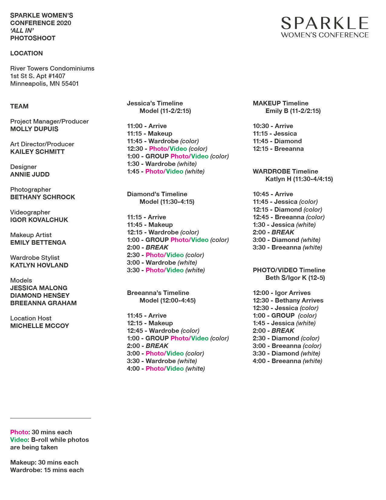
I planned and produced a full-day photoshoot to use as promotional content, which included finding a location, gathering and coordinating a team of eight people and three models, creating a schedule, buying props and creating a shot list.
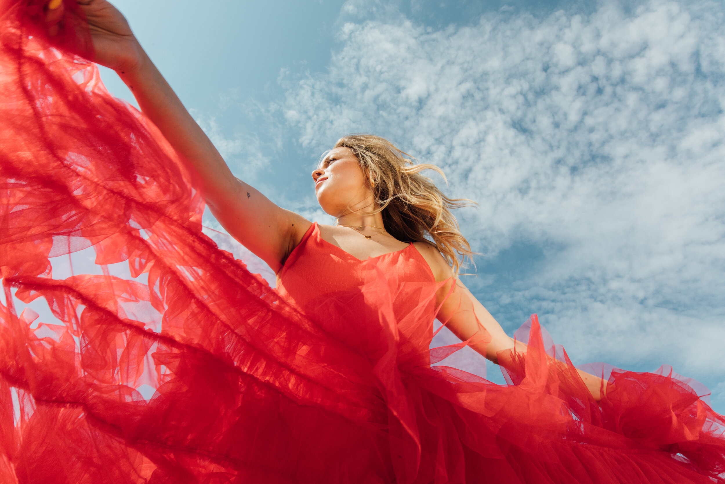
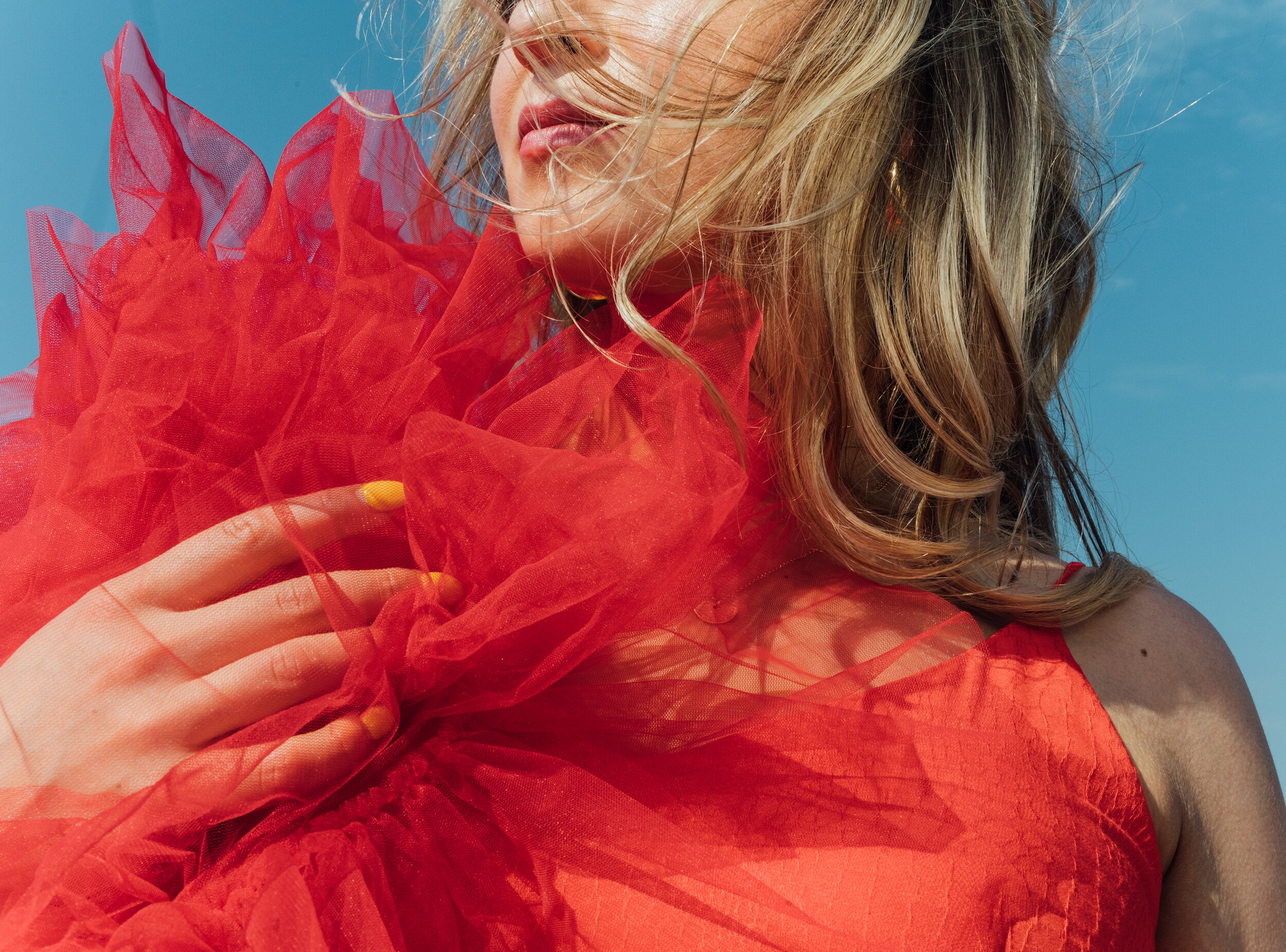
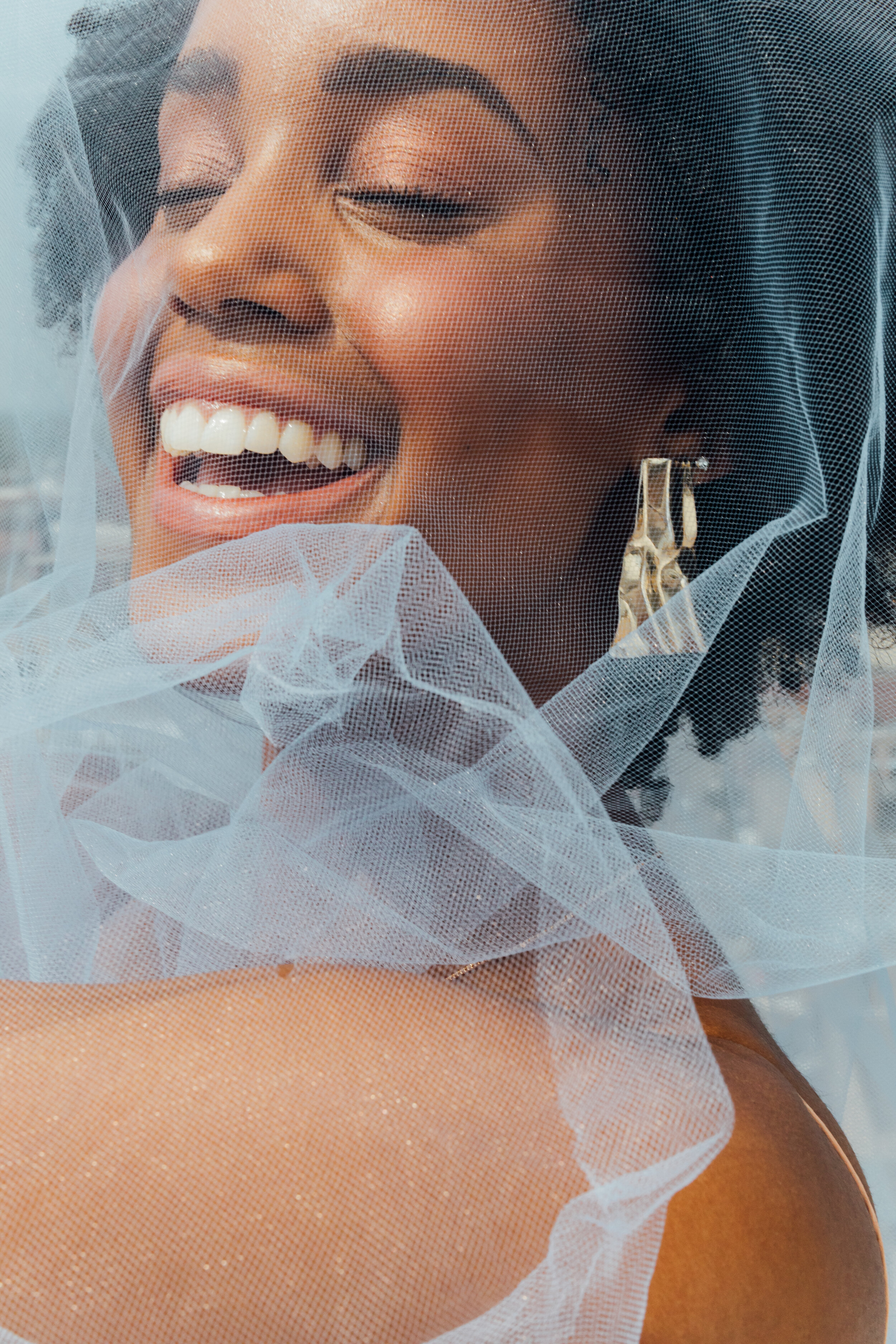
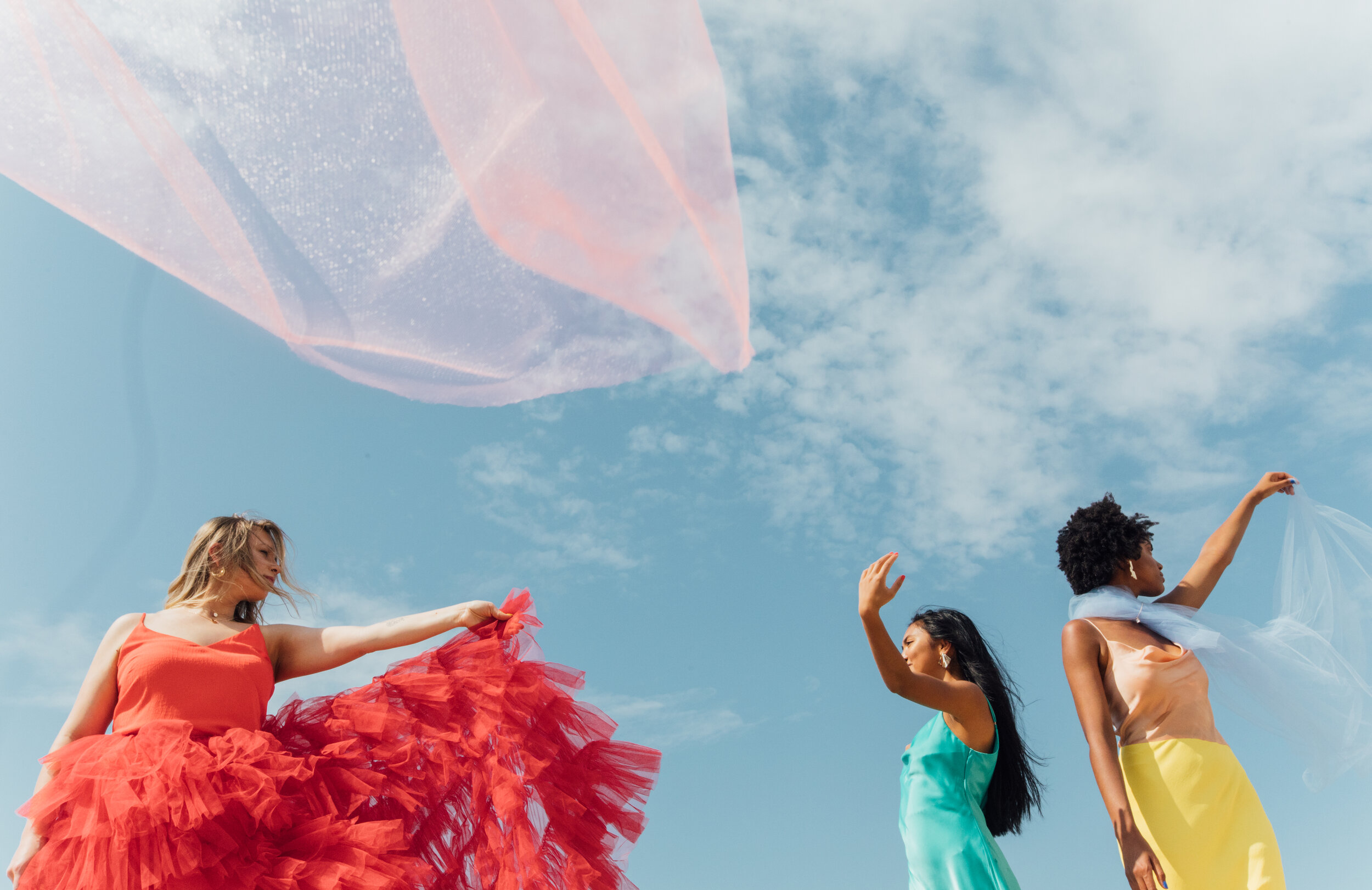
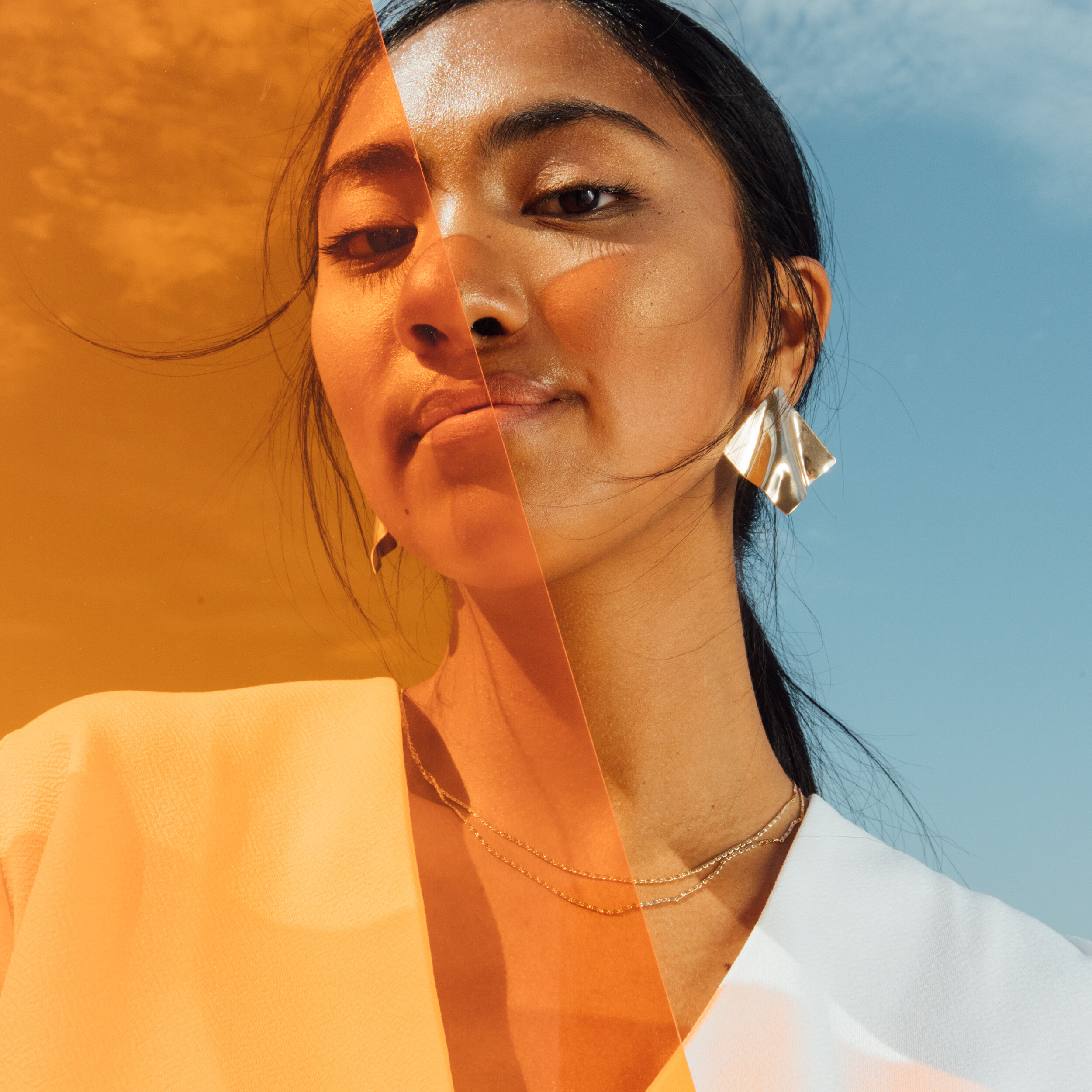
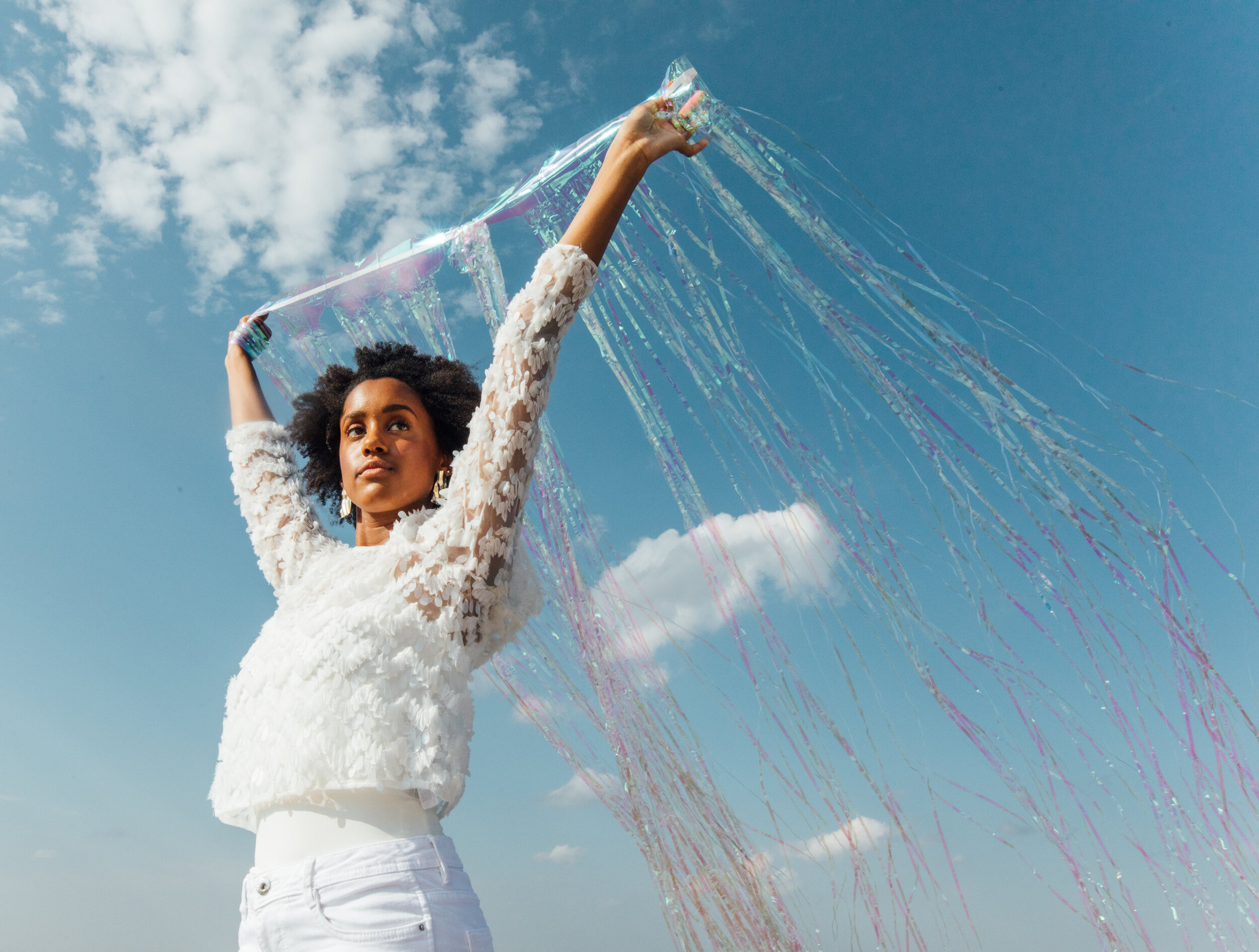
We wanted the backdrop of all of the photos to be the blue sky, so we shot on the roof of a 28-floor building. There were two scenes in the shoot that were dictated by a change of wardrobe, props and posing styles, as outlined below.
Styling
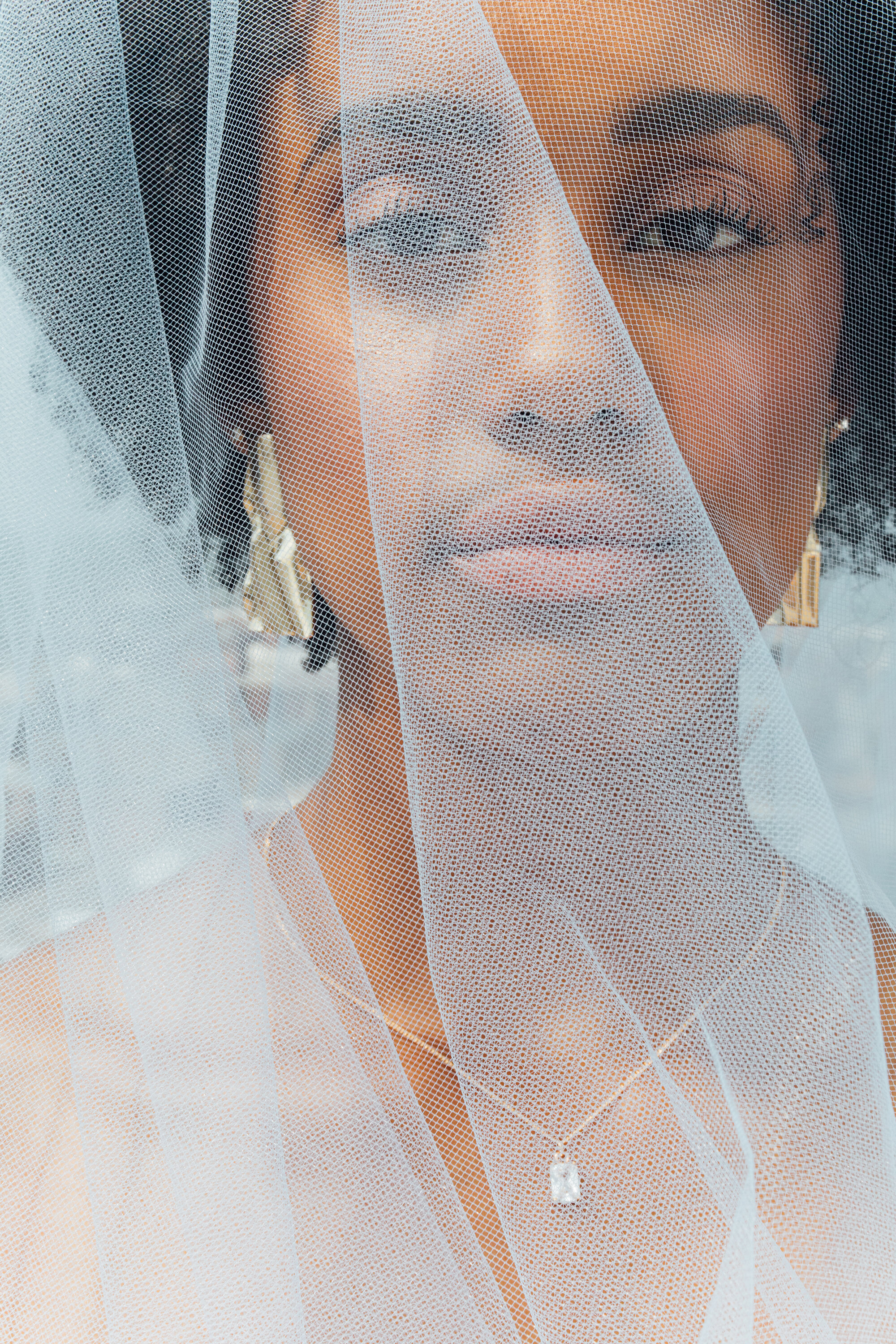
I collaborated with stylist Katlyn Hovland to pull together looks that followed the direction of the brand and fit in the color palette. We decided to have two looks for each of the three models — the first look would be a full blast of color, while the second look would be all-white. We decided to do this to provide a wide range of visual content to use as promotional material over the next few months. The all-white look would really compliment the vibrant graphic pattern (which was planned to interlock through and over the photos in post-production) and the all-color look would look great on its own against the blue sky.








Credits
Client Becca Ketterling & Sparkle Conference Team
Creative Direction Darren Lee
Art Direction Kailey Schmitt
Producers Molly Dupuis & Kailey Schmitt
Account Management Molly Dupuis
Photography Bethany Schrock
Makeup Emily Bettenga
Styling Katlyn Hovland & Kailey Schmitt
Graphic Design Annie Judd
Videography Igor Kovalchuk
Video Editing Nick Kallies